#1
Selling Snapp Pro
Mid-Ride
Only 1.2% of people who opened the Pro page bought it. I moved the purchase into the ride, and daily Pro purchases went from about 8,000 to 21,000.
- Company
- Snapp
- Role
- Product designer
- Team
- Me as the designer, a product manager, a UX researcher, a UX writer, developers
- Date
- 2025
Summary
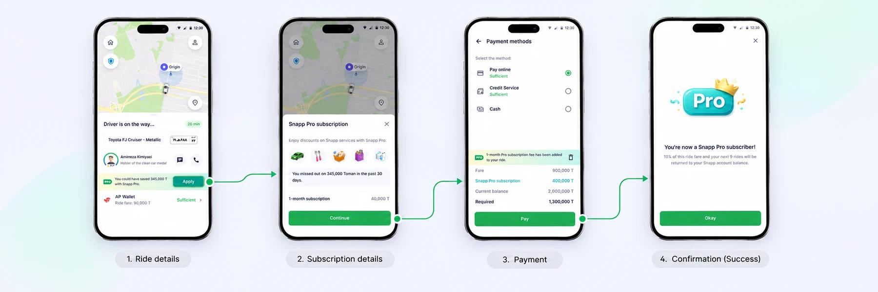
I moved the Snapp Pro purchase from a separate page on the homepage into the ride itself, so riders could add a subscription to the trip they were already paying for.
In the first 3 months, the in-ride flow added about 13,000 Pro purchases a day, on top of the 8,000 that still came from the homepage.
Context
Snapp Pro is Snapp’s premium monthly subscription. Members get 8 ride discounts a month, discounts at partner restaurants, and dedicated support. For the business it is a high-value product: it brings recurring revenue and ties frequent riders more closely to the app.
Problem
To buy Pro, a rider had to find it on the homepage, open its page, pick a plan and complete a separate payment. Only 1.2% of people who opened the Pro page went on to buy, and nothing in that path connected Pro to a moment when its value was obvious.
make buying Pro part of a ride the user is already taking and paying for?
Insight
The idea came from benchmarking. Many apps offer related items or memberships just before checkout, and similar apps in our space already did the same.
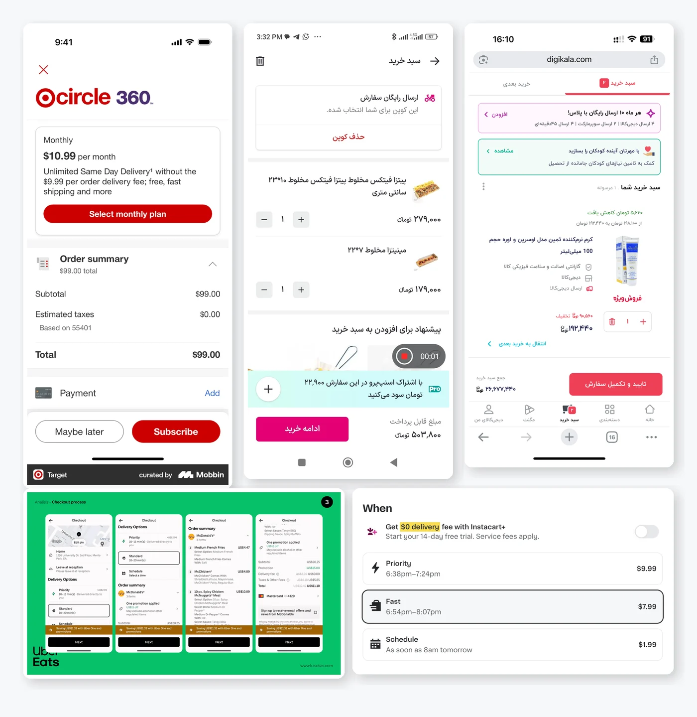
Our riders pay for a trip every day. If Pro could be added to that payment, they would go through the payment gateway once instead of starting a second purchase. We chose the in-ride moment for two reasons:
- The benefit is immediate. The rider can use their Pro discount on the ride they are taking.
- The value is easy to see. Pro makes the most sense while the user is looking at the price of a real trip.
Design decisions
Every decision followed one rule: the rider is in a moving car, so the flow has to be short, calm and never take them out of the ride.
1. A card that shows the user’s own savings
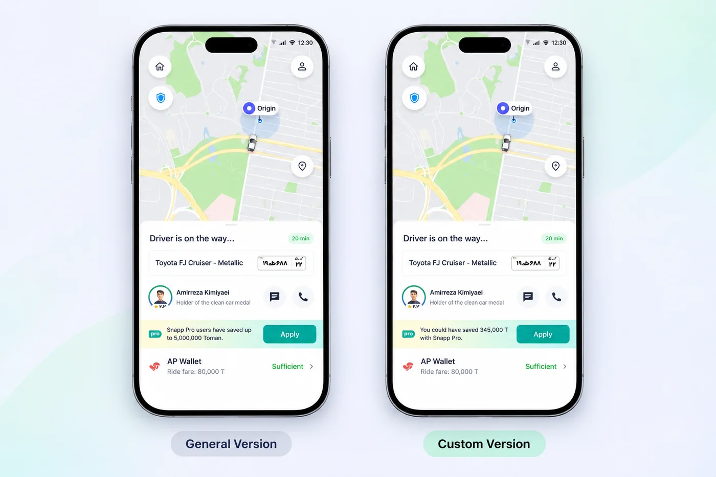
During the ride, the main screen shows a Pro card, and its message changes with the user’s ride history. If their data shows Pro would have saved them more than it costs, we show their own number: “You could have saved 345,000 T with Snapp Pro.” For light riders, a small personal number wouldn’t convince anyone, so we show what Pro members save instead.
2. A bottom sheet, not a landing page
Tapping the card opens a bottom sheet with the price and length of the subscription. We weighed a rich landing page against a minimal sheet and chose the sheet: it keeps the user inside the app, keeps the map visible behind it, and doesn’t pull attention away from the trip.
3. One plan instead of three
Three plans felt like too much choice for someone mid-ride. We tested a single 1-month plan against a choice of three, and the single plan won. With the business team we kept the 1-month plan, which is also the cheapest.
4. One payment for ride and Pro
After adding Pro, the user sees its price next to the ride fare on the payment screen. With enough wallet balance they pay both at once. Otherwise they go to the payment gateway once and pay only the difference. Pro activates right after payment, so the discount can apply to the current ride.
5. Protecting the ride payment
The ride team’s biggest worry was that a larger total would make users regret the purchase and leave the ride unpaid. We answered it in the design:
- One-tap removal. Pro can be taken out of the basket right on the payment screen.
- The cheapest plan. Keeping the added cost low keeps the total close to a normal ride.
A/B test
For 1 month, 5% of riders saw one of two versions. Users who saw a single plan added Pro to their basket about 20% more often than users who could choose between three. That settled the decision, and we removed the plan choice from the in-ride flow.
Variant A: three plans to choose from
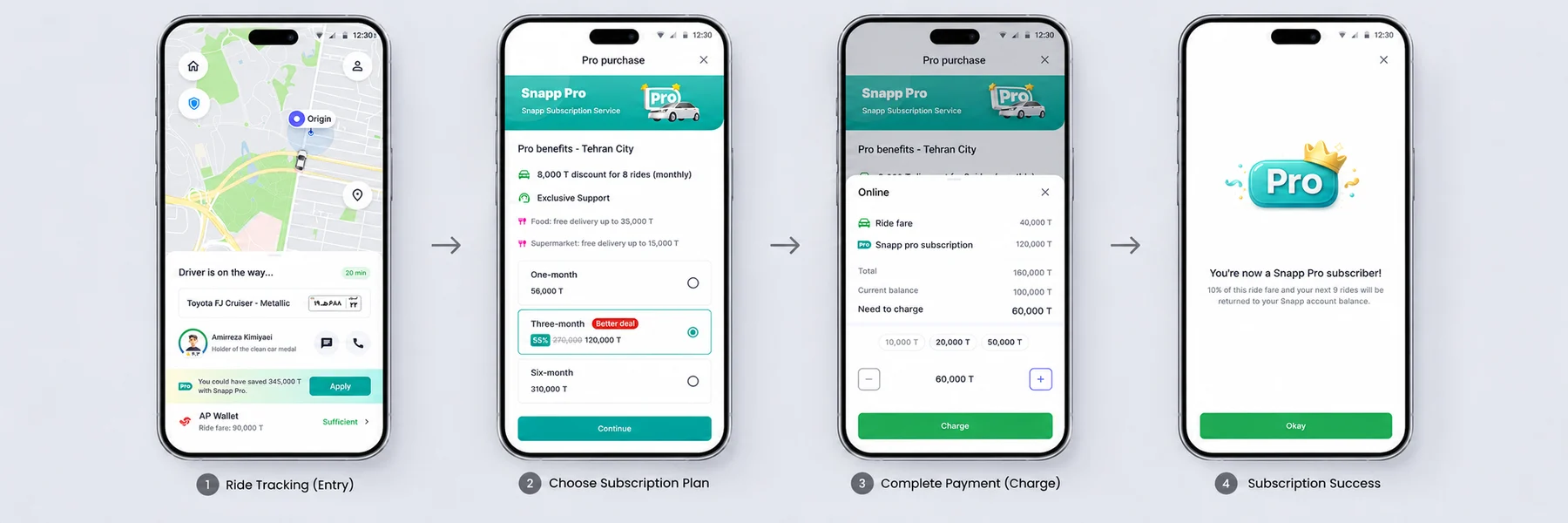
Variant B: one 1-month plan (shipped)
Results
In the first 3 months, the in-ride flow averaged about 30,000 add-to-baskets and 13,000 completed Pro purchases a day. The homepage path stayed live and its sales didn’t drop, so these were new purchases, not ones moved from one path to another.
- All Pro purchases, up from 8K21K
- Interested users who bought Pro, up from 1.2%5%
The ride team’s worry didn’t happen. Unpaid rides showed no noticeable change, and fewer than 1% of users took Pro back out of the basket.
What I learned
- Small variations change payment results a lot. Removing one choice changed add-to-baskets by about 20%, with the same product and the same price. In payment flows I now treat every extra decision as a cost and test it instead of debating it.
- Timing sells better than persuasion. Pro didn’t change. Showing it at the moment its discount could be used made the value easy to see.
- Answer stakeholder risk in the design. The worry about unpaid rides shaped two decisions, and the data later showed no change in unpaid rides.