#2
Open Doors Cause
Many Problems!
Users couldn’t tell which locker door had opened for them, and many left it open. A few changes in the web app cut support calls about it from 12% of orders to 1%.
- Date
- December 1, 2022 to February 1, 2023
- Company
- Ganje
- Focus
- Field research, web app flow, UI
Summary
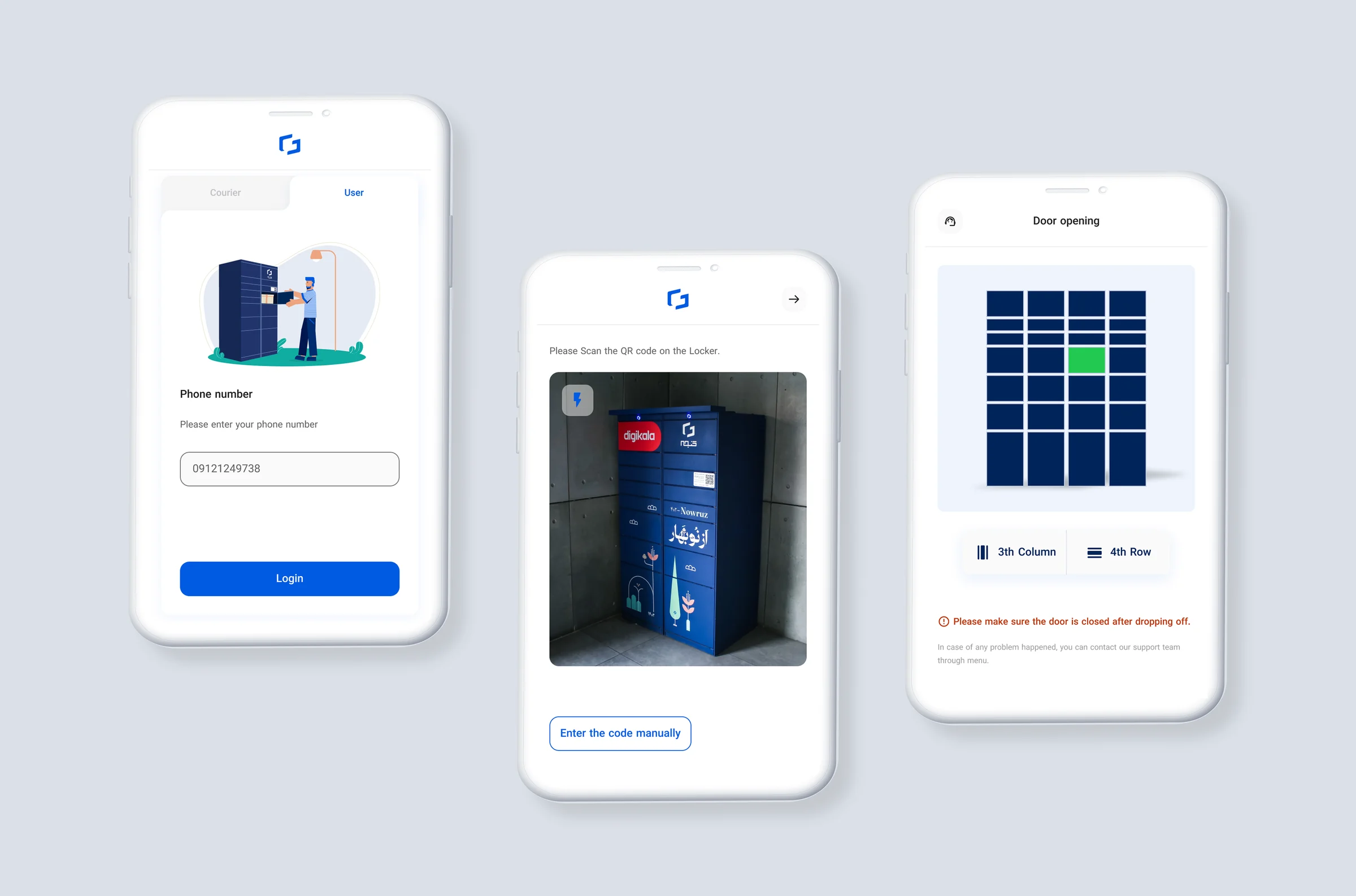
As the designer of Ganje’s smart locker system, I worked on the problem of locker doors left open. By showing the reserved locker clearly in the web app and adding informative alerts, users could find their locker easily and close the door after use.
Overview
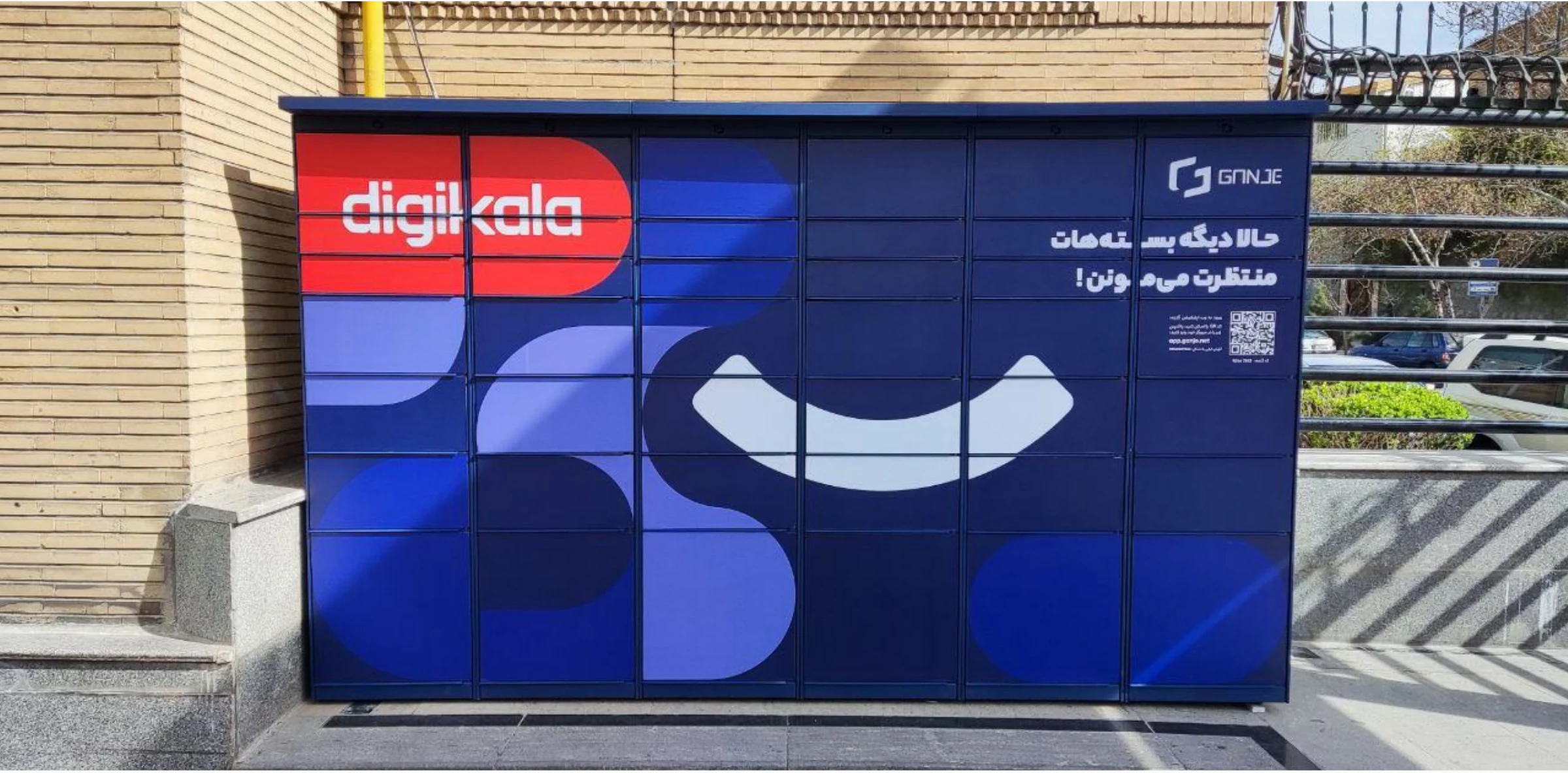
A Ganje locker is a smart locker that receives parcels on behalf of users. These are secure storage and distribution systems with built-in computers and sensor networks that give users self-pickup delivery. Through a web application, users connect to lockers to pick up and drop off their shipments.
Problem
Field observation and CRM calls showed that it was sometimes hard for users to tell which locker door had opened for them, especially at big stations (racks with more than 20 doors) or in noisy outdoor spots.
My assumption
There were two possible scenarios:
- The door didn’t open properly, so users didn’t notice it.
- Too many doors were already open, so users got confused about which one was theirs.
Getting to know the problem
To solve the problem, we first needed to know why and how often it happened.
How the product worked
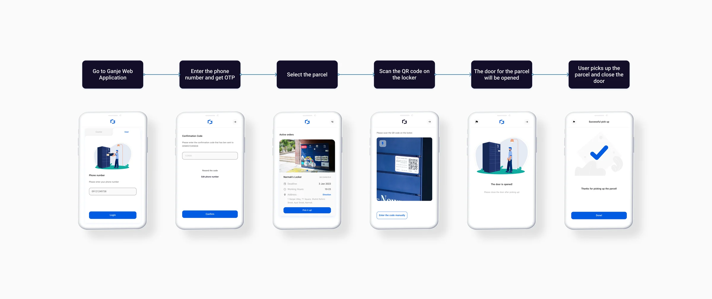
To analyze each part of the problem, it was important to understand the user’s journey through the web application.
Checking the locker sensors
The sensor logs showed that about 13% of locker doors stayed open after popping open.
86.5%closed
13.5%stayed open
Survey
To measure how hard it was to find the opened door, we ran a survey in the web application and asked users whether they found it easily. About 13% couldn’t find their parcel’s door.
405yes, 87.3%
59no, 12.7%
Meeting with the CRM team
CRM calls showed that open doors confused users and led them to call for help.
Field study
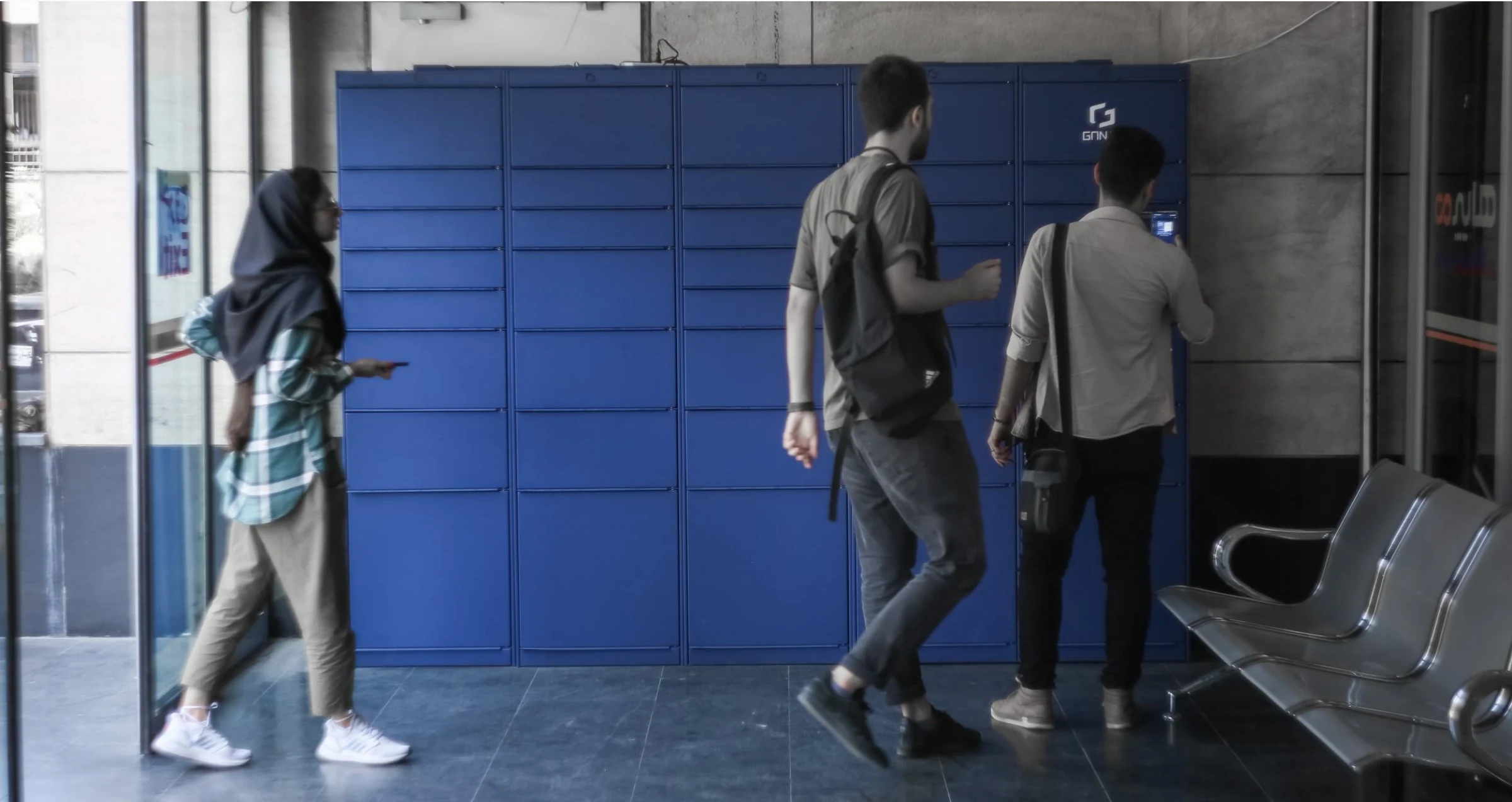
We spent 3 days at different stations watching how people picked up their parcels. What we saw:
- Doors left open by the previous user. This was the most common reason. Users went to a door that was already open and found an empty locker.
- Noise. In noisy places people didn’t hear the door open.
- Doors that didn’t open fully.
Breaking the problem into pieces
With this data, I split the problem into smaller parts and looked at each one separately.
Problem 1: users couldn’t find their reserved locker
The solution seemed simple: show them their reserved locker. We considered two approaches:
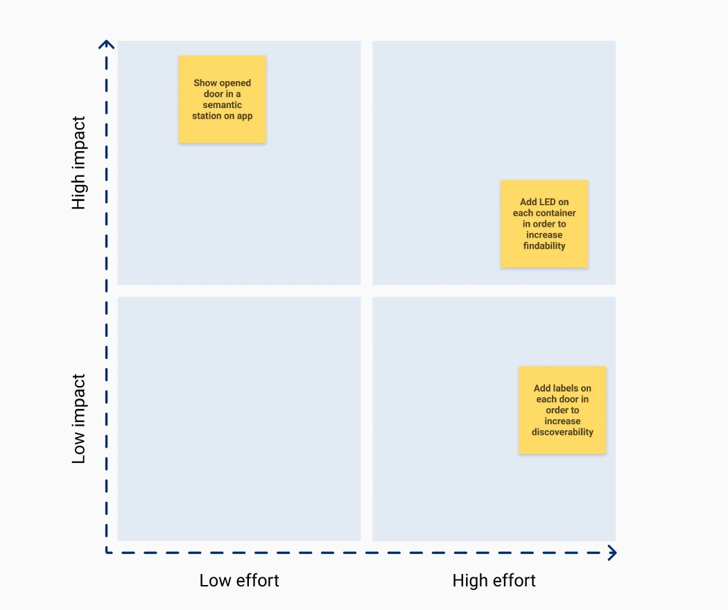
- Add LEDs or labels on the lockers to mark open doors.
- Highlight the reserved locker in our web app.
With 30 stations in Tehran (around 120 racks), physical changes would have created serious operational challenges. Our locker fronts are also used as advertising space for businesses. Together with operations and engineering, we built an effort and impact matrix and reached agreement.
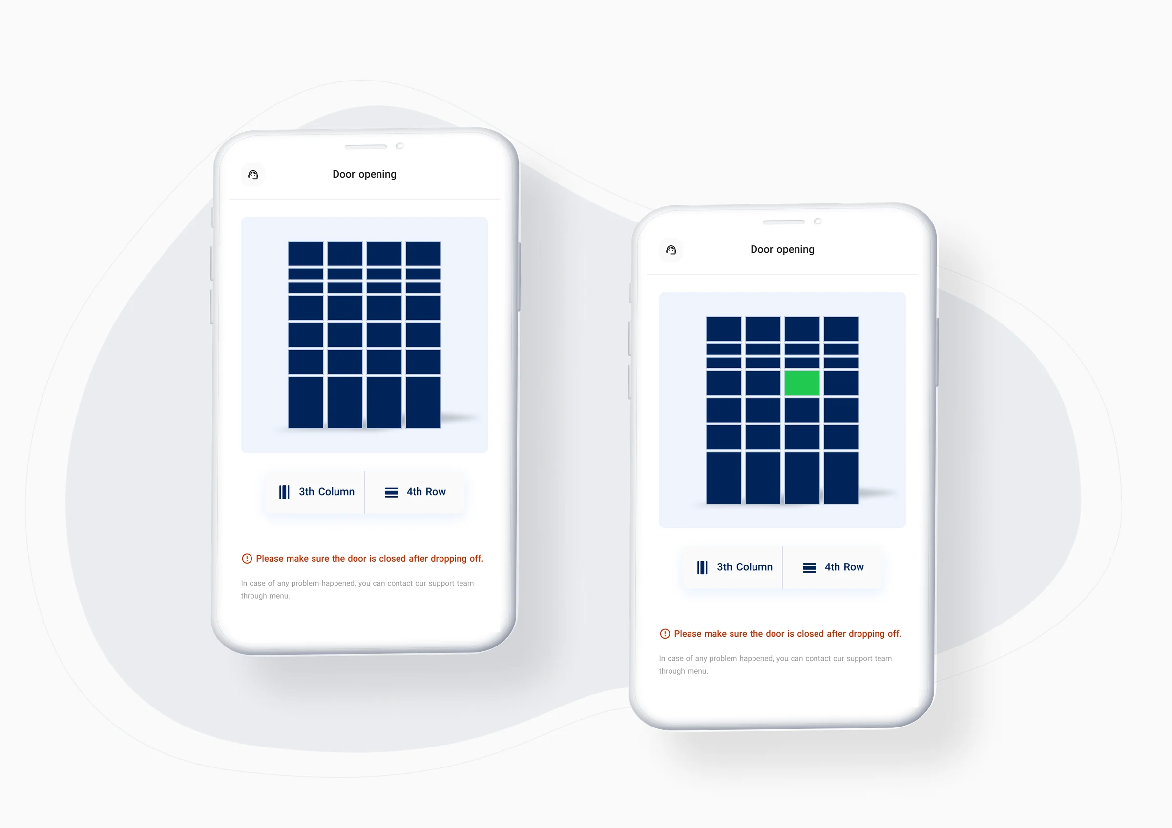
We chose to show a map of the station in the web app. First we had to make sure the technical team could build it: stations have different layouts (number of racks, types and arrangements), so the app had to simulate each one accurately.
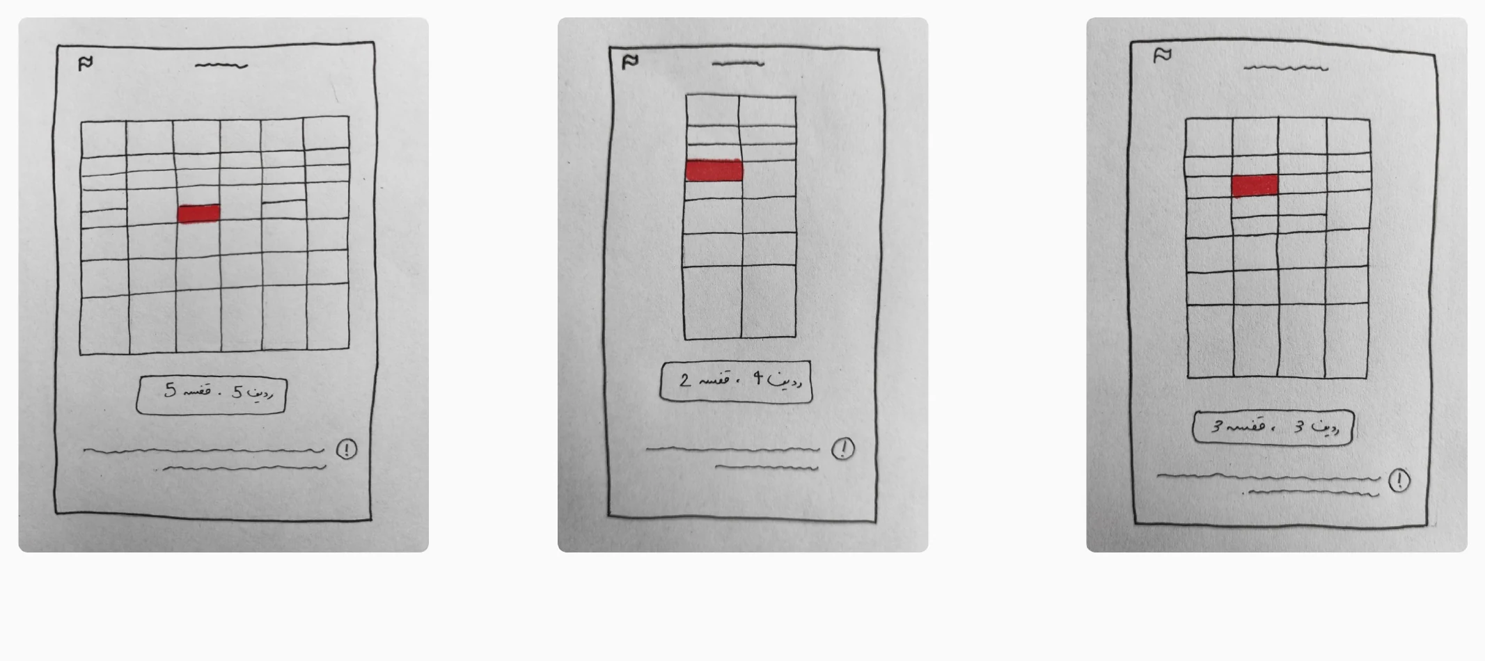
After the CTO reviewed and approved these wireframes, I started on the UI.
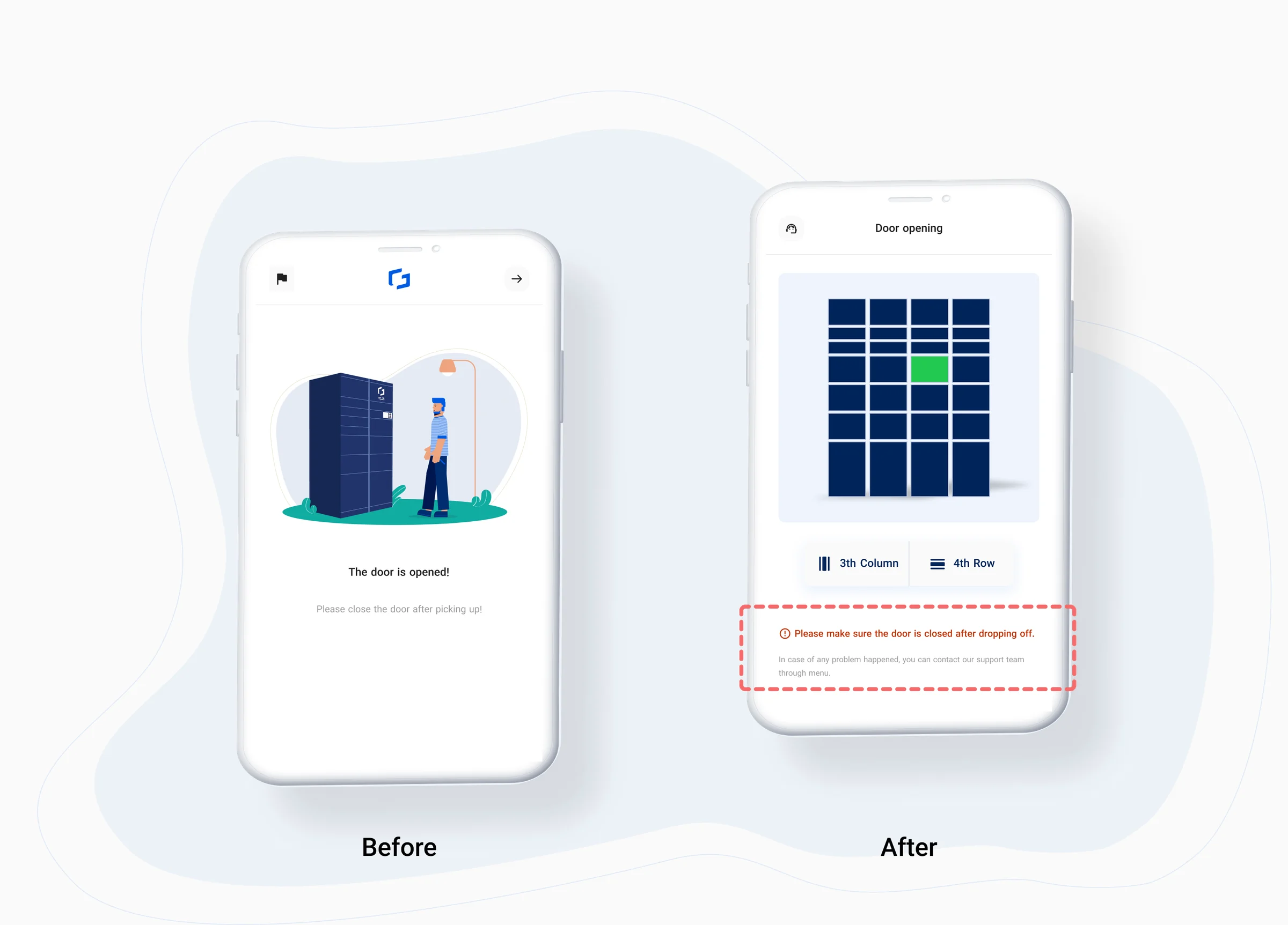
Problem 2: users didn’t close the door after picking up their parcel
Digging further, we saw that this affected couriers too. Doors left open caused confusion and misplaced parcels, and took a lot of operational effort to fix, so making sure every user closed the door was crucial.
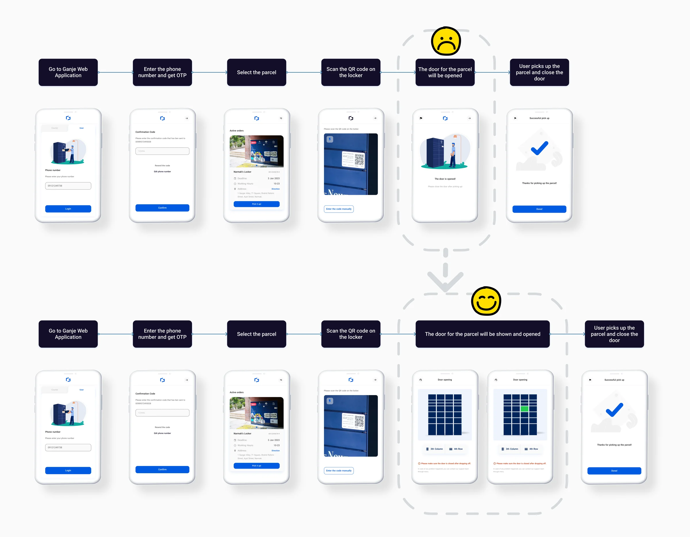
Physical solutions were costly and complex, so we solved it in the web application. Adding an alert on the door-opening page made users more confident about closing the door, and led to a redesign of that page.
The new user flow
Changes for couriers
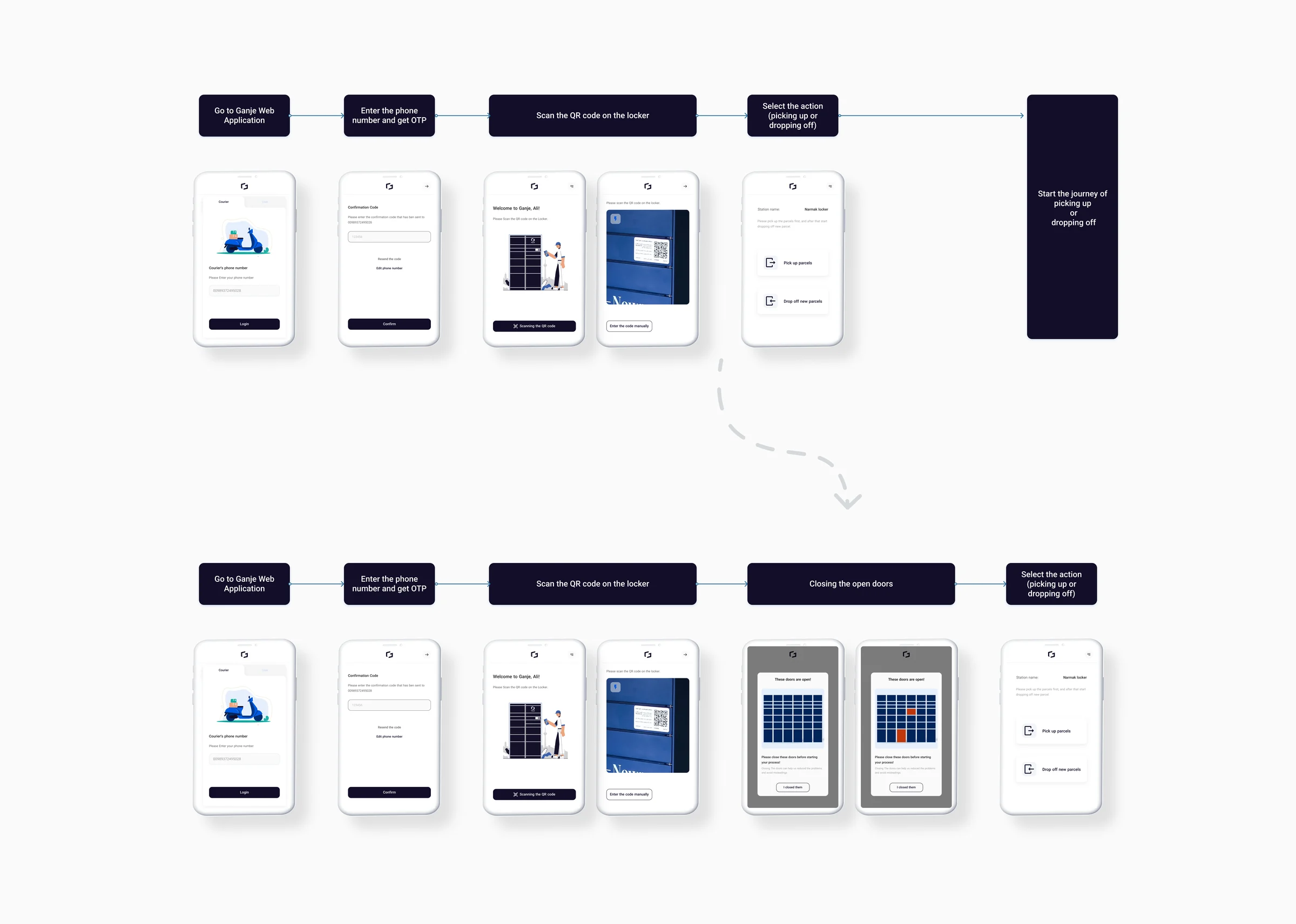
After launching the changes for users and monitoring them, we updated the courier web app to reduce loading mistakes. At the start of their journey, couriers now see the open doors and are asked to close them. For every parcel, they also see which locker is about to open.
Testing
We ran a usability test with a prototype to check whether users could identify the right door. All 12 participants found their door without any confusion.
Results
- CRM calls about open doors, share of orders1%
- Users who couldn’t find the door2%
- Doors left open5%
- Within two weeks of launch, CRM calls about the problem dropped from about 12% to 1% of orders.
- We ran the survey again, and users who couldn’t find the door fell to 2%.
- The share of doors left open dropped from 13% to 5%.
Outcome
The most interesting part of this work for me was seeing how my designs affected users and the company. I learned that small changes can make a big difference: at Ganje, a few changes to the web app and some well-placed alerts reduced customer calls about open doors, a reminder of how much small improvements can do for user experience and operations.